Students calculate the mean absolute deviation (MAD) for three data sets and …
Students calculate the mean absolute deviation (MAD) for three data sets and use it to decide which data set is best represented by the mean.The concept of mean absolute deviation (MAD) is introduced. Students understand that the sum of the deviation of the data from the mean is zero. Students calculate the MAD and understand its significance. Students find the mean and MAD of a sample set of data.Key ConceptsThe mean absolute deviation (MAD) is a measure of how much the values in a data set deviate from the mean. It is calculated by finding the distance of each value from the mean and then finding the mean of these distances.Goals and Learning ObjectivesGain a deeper understanding of mean.Understand that the mean absolute deviation (MAD) is a measure of how well the mean represents the data.Compare data sets using measures of center (mode, median, mean) and spread (range and MAD).Show that the sum of deviations from the mean is zero.
Students make a box plot for their typical-sixth-grader data from Lesson 7 …
Students make a box plot for their typical-sixth-grader data from Lesson 7 and write a summary of what the plot shows.Using the line plot from Lesson 4, students construct a box plot. Students learn how to calculate the five-number summary and interquartile range (IQR). Students apply this knowledge to the data used in Lesson 7 and describe the data in terms of the box plot. Class discussion focuses on comparing the two graphs and what they show for the sets of data.Key ConceptsA box-and-whisker plot, or box plot, shows the spread of a set of data. It shows five key measures, called the five-number summary.Lower extreme: The smallest value in the data setLower quartile: The middle of the lower half of the data, and the value that 25% of the data fall belowMedian: The middle of the data setUpper quartile: The middle of the upper half of the data, and the value that 25% of the data are aboveUpper extreme: The greatest value in the data setThis diagram shows how these values relate to the parts of a box plot.The length of the box represents the interquartile range (IQR), which is the difference between the lower and upper quartile.A box plot divides the data into four equal parts. One quarter of the data is represented by the left whisker, two quarters by each half of the box, and one quarter by the right whisker. If one of these parts is long, the data in that quarter are spread out. If one of these quarters is short, the data in that quarter are clustered together.Goals and Learning ObjectivesLearn how to construct box plots, another tool to describe data.Learn about the five-number summary, interquartile range, and how they are related to box plots.Compare a line plot and box plot for the same set of data.
Students critique and improve their work on the Self Check from Lesson …
Students critique and improve their work on the Self Check from Lesson 13.Key ConceptsMeasures of spread (five-number summary) show characteristics of the data. It is possible to generate an appropriate data set with this information.Goals and Learning ObjectivesApply knowledge of statistics to solve problems.Identify the five-number summary, and understand measures of center and use their properties to solve problems.Track and review choice of strategy when problem solving.
In this lesson, students draw a line plot of a set of …
In this lesson, students draw a line plot of a set of data and then find the mean of the data. This lesson also informally introduces the concepts of the median, or middle value, and the mode, or most common value. These terms will be formally defined in Lesson 6.Using a sample set of data, students review construction of a line plot. The mean as fair share is introduced as well as the algorithm for mean. Using the sample set of data, students determine the mean and informally describe the set of data, looking at measures of center and the shape of the data. Students also determine the middle 50% of the data.Key ConceptsThe mean is a measure of center and is one of the ways to determine what is typical for a set of data.The mean is often called the average. It is found by adding all values together and then dividing by the number of values.A line plot is a visual representation of the data. It can be used to find the mean by adjusting the data points to one value, such that the sum of the data does not change.Goals and Learning ObjectivesReview construction of a line plot.Introduce the concept of the mean as a measure of center.Use the fair-share method and standard algorithm to find the mean.
Students make a histogram of their typical-student data and then write a …
Students make a histogram of their typical-student data and then write a summary of what the histogram shows.Students are introduced to histograms, using the line plot to build them. They investigate how the bin width affects the shape of a histogram. Students understand that a histogram shows the shape of the data, but that measures of center or spread cannot be found from the graph.Key ConceptsA histogram groups data values into intervals and shows the frequency (the number of data values) for each interval as the height of a bar.Histograms are similar to line plots in that they show the shape and distribution of a data set. However, unlike a line plot, which shows frequencies of individual data values, histograms show frequencies of intervals of values.We cannot read individual data values from a histogram, and we can't identify any measures of center or spread.Histograms sometimes have an interval with the most data values, referred to as the mode interval.Histograms are most useful for large data sets, where plotting each individual data point is impractical.The shape of a histogram depends on the chosen width of the interval, called the bin width. Bin widths that are too large or too small can hide important features of the data.Goals and Learning ObjectivesLearn about histograms as another tool to describe data.Show that histograms are used to show the shape of the data for a wider range of data.Compare a line plot and histogram for the same set of data.
Students use the Box Plot interactive, which allows them to create line …
Students use the Box Plot interactive, which allows them to create line plots and see the corresponding box plots. They use this tool to create data sets with box plots that satisfy given criteria.Students investigate how the box plot changes as the data points in the line plot are moved. Students can manipulate data points to change aspects of the box plot and to see how the line plot changes. Students create box plots that fit certain criteria.Key ConceptsThis lesson focuses on the connection between a data set and its box plot. It reinforces the idea that a box plot shows the spread of a data set, but not the individual data points.Students will observe the following similarities and differences between line plots and box plots:Line plots allow us to see and count individual values, while box plots do not.Line plots allow us to find the mean and the mode of a set of data, while box plots do not.Box plots are useful for very large data sets, while line plots are not.Box plots give us a better picture of how the values in a data set are distributed than line plots do, and they allow us to see measures of spread easily.Goals and Learning ObjectivesExperiment with different line plots to see the effect on the corresponding box plots.Create data sets with box plots that satisfy different criteria.Compare and contrast line plots and box plots.
Lesson OverviewStudents complete a card sort that requires them to match sets …
Lesson OverviewStudents complete a card sort that requires them to match sets of statistics with the corresponding line plots.Students match cards with simple line plots to the corresponding card with measures of center. Some cards include mode, mean, median, and range, and some have one or two measures missing. Students discuss how they determined which cards would match.Key ConceptsTo complete the card sort in this lesson efficiently, students must be able to relate statistical measures with line plots. If they start with the measures that are easy to see, they can narrow down the possible matches.The mode is the easiest measure to see immediately. It is simply the number with the tallest column of dots.The range can be found easily by subtracting the least value in the plot from the greatest.The median can be found fairly quickly by counting to the middle dot or by pairing dots on the ends until reaching the middle.The mean must be calculated by adding data values and dividing.Goals and Learning ObjectivesApply knowledge of measures of center and range to solve problems.Discuss and review strategy choices when problem solving.
Students will apply what they have learned in previous lessons to analyze …
Students will apply what they have learned in previous lessons to analyze and draw conclusions about a set of data. They will also justify their thinking based on what they know about the measures (e.g., I know the mean is a good number to use to describe what is typical because the range is narrow and so the MAD is low.).Students analyze one of the data sets about the characteristics of sixth grade students that was collected by the class in Lesson 2. Students construct line plots and calculate measures of center and spread in order to further their understanding of the characteristics of a typical sixth grade student.Key ConceptsNo new mathematical ideas are introduced in this lesson. Instead, students apply the skills they have acquired in previous lessons to analyze a data set for one attribute of a sixth grade student. Students make a line plot of the data and find the mean, median, range, MAD, and outliers. They use these results to determine a typical value for their data.Goals and Learning ObjectivesDescribe an attribute of a typical sixth grade student using line plots and measures of center (mean and median) and spread (range and MAD).Justify thinking about which measures are good descriptors of the data set.
Students explore how adjusting the bin width or adding, deleting, or moving …
Students explore how adjusting the bin width or adding, deleting, or moving data values affects a histogram.Students use the Histogram interactive to explore how the bin width can affect how the data are displayed and interpreted. Students also explore how adjusting the line plot affects the histogram.Key ConceptsAs students learned in the last lesson, a histogram shows data in intervals. It shows how much data is in each bin, but it does not show individual data. In this lesson, students will see that the same histogram can be made with different sets of data. Students will also see that the bin width can greatly affect how the histogram looks.Goals and Learning ObjectivesExplore what the shape of the histogram tells us about the data set and how the bin width affects the shape of the histogram.Clarify similarities and differences between histograms and line plots.Compare a line plot and histogram for the same set of data.
In this lesson, students are given criteria about measures of center, and …
In this lesson, students are given criteria about measures of center, and they must create line plots for data that meet the criteria. Students also explore the effect on the median and the mean when values are added to a data set.Students use a tool that shows a line plot where measures of center are shown. Students manipulate the graph and observe how the measures are affected. Students explore how well each measure describes the data and discover that the mean is affected more by extreme values than the mode or median. The mathematical definitions for measures of center and spread are formalized.Key ConceptsStudents use the Line Plot with Stats interactive to develop a greater understanding of the measures of center. Here are a few of the things students may discover:The mean and the median do not have to be data points.The mean is affected by extreme values, while the median is not.Adding values above the mean increases the mean. Adding values below the mean decreases the mean.You can add values above and below the mean without changing the mean, as long as those points are “balanced.”Adding values above the median may or may not increase the median. Adding values below the median may or may not decrease the median.Adding equal numbers of points above and below the median does not change the median.The measures of center can be related in any number of ways. For example, the mean can be greater than the median, the median can be greater than the mean, and the mode can be greater than or less than either of these measures.Note: In other courses, students will learn that a set of data may have more than one mode. That will not be the case in this lesson.Goals and Learning ObjectivesExplore how changing the data in a line plot affects the measures of center (mean, median).Understand that the mean is affected by outliers more than the median is.Create line plots that fit criteria for given measures of center.
This lesson unit is intended to help you assess how well students …
This lesson unit is intended to help you assess how well students are able to: Calculate the mean, median, mode, and range from a frequency chart; and to use a frequency chart to describe a possible data set, given information on the mean, median, mode, and range.
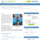
Student teams build model hand dynamometers used to measure grip strengths of …
Student teams build model hand dynamometers used to measure grip strengths of people recovering from sports injuries. They use their models to measure how much force their classmates muscles are capable of producing, and analyze the data to determine factors that influence a person's grip strength. They use this information to produce a recommendation of a hand dynamometer design for a medical office specializing in physical therapy. They also consider the many other ways grip strength data is used by engineers to design everyday products.
Our project involves students learning about the values of a natural area …
Our project involves students learning about the values of a natural area in their community and producing a public service announcement and map to show its value and how it could be developed.
The intent of clarifying statements is to provide additional guidance for educators …
The intent of clarifying statements is to provide additional guidance for educators to communicate the intent of the standard to support the future development of curricular resources and assessments aligned to the 2021 math standards. Clarifying statements can be in the form of succinct sentences or paragraphs that attend to one of four types of clarifications: (1) Student Experiences; (2) Examples; (3) Boundaries; and (4) Connection to Math Practices.
Students further their understanding of the engineering design process (EDP) while being …
Students further their understanding of the engineering design process (EDP) while being introduced to assistive technology devices and biomedical engineering. They are given a fictional client statement and are tasked to follow the steps of the EDP to design and build small-scale, off-road wheelchair prototypes. As part of the EDP, students identify appropriate materials and demonstrate two methods of representing solutions to their design problem (scale drawings and simple scale models). They test the scale model off-road wheelchairs using spring scales to pull the prototypes across three different simulated off-road surfaces.
In this activity, students will learn about Newton's 2nd Law of Motion. …
In this activity, students will learn about Newton's 2nd Law of Motion. They will learn that the force required to move a book is proportional to the weight of the book. Engineers use this relationship to determine how much force they need to move an airplane.
Students observe and test their reflexes, including the (involuntary) pupillary response and …
Students observe and test their reflexes, including the (involuntary) pupillary response and (voluntary) reaction times using their dominant and non-dominant hands, as a way to further explore how reflexes occur in humans. They gain insights into how our bodies react to stimuli, and how some reactions and body movements are controlled automatically, without conscious thought. Using information from the associated lesson about how robots react to situations, including the stimulus-to-response framework, students see how engineers use human reflexes as examples for controls for robots.
Students conduct an experiment to determine the relationship between the speed of …
Students conduct an experiment to determine the relationship between the speed of a wooden toy car at the bottom of an incline and the height at which it is released. They observe how the photogate-based speedometer instrument "clocks" the average speed of an object (the train). They gather data and create graphs plotting the measured speed against start height. After the experiment, as an optional extension activity, students design brakes to moderate the speed of the cart at the bottom of the hill to within a specified speed range.
Students are introduced to several types of common medical sensor devices, such …
Students are introduced to several types of common medical sensor devices, such as ear and forehead thermometers, glucometers and wrist blood pressure monitors; they use the latter to measure their blood pressure and pulse rates. Students also measure their heights and weights in order to calculate their BMIs (body mass index). Then they use the collected data to create and analyze scatterplots of the different variables to determine if any relationships exist between the measured variables. Discussions about the trends observed and possible health concerns conclude the activity.
Students learn about two types of friction static and kinetic and the …
Students learn about two types of friction static and kinetic and the equation that governs them. They also measure the coefficient of static friction experimentally.
No restrictions on your remixing, redistributing, or making derivative works. Give credit to the author, as required.
Your remixing, redistributing, or making derivatives works comes with some restrictions, including how it is shared.
Your redistributing comes with some restrictions. Do not remix or make derivative works.
Most restrictive license type. Prohibits most uses, sharing, and any changes.
Copyrighted materials, available under Fair Use and the TEACH Act for US-based educators, or other custom arrangements. Go to the resource provider to see their individual restrictions.