Students complete three different activities to evaluate the energy consumption in a …
Students complete three different activities to evaluate the energy consumption in a household and explore potential ways to reduce that consumption. The focus is on conservation and energy efficient electrical devices and appliances. The lesson reinforces the relationship between power and energy and associated measurements and calculations required to evaluate energy consumption. The lesson provides the students with more concrete information for completing their culminating unit assignment.
In this lesson and its associated activity, students conduct a simple test …
In this lesson and its associated activity, students conduct a simple test to determine how many drops of each of three liquids can be placed on a penny before spilling over. The three liquids are water, rubbing alcohol, and vegetable oil; because of their different surface tensions, more water can be piled on top of a penny than either of the other two liquids. However, this is not the main point of the activity. Instead, students are asked to come up with an explanation for their observations about the different amounts of liquids a penny can hold. In other words, they are asked to make hypotheses that explain their observations, and because middle school students are not likely to have prior knowledge of the property of surface tension, their hypotheses are not likely to include this idea. Then they are asked to come up with ways to test their hypotheses, although they do not need to actually test their hypotheses. The important points for students to realize are that 1) the tests they devise must fit their hypotheses, and 2) the hypotheses they come up with must be testable in order to be useful.
Students keep track of their own water usage for one week, gaining …
Students keep track of their own water usage for one week, gaining an understanding of how much water is used for various everyday activities. They relate their own water usages to the average residents of imaginary Thirsty County, and calculate the necessary water capacity of a dam that would provide residential water to the community.
In this interactive activity adapted from Annenberg Learner's Teaching Math Grades 6–8, …
In this interactive activity adapted from Annenberg Learner's Teaching Math Grades 6–8, explore some of the ways graphs can represent mathematical data contained in a story.
In this activity, students learn how to prevent exposure to the Sun's …
In this activity, students learn how to prevent exposure to the Sun's harmful ultraviolet rays. Students will systematically test various sunscreens to determine the relationship between spf (sun protection factor) value and sun exposure. At the end of the activity, students are asked to consider how this investigation could be used to help them design a new sunscreen.
Students observe demonstrations, and build and evaluate simple models to understand the …
Students observe demonstrations, and build and evaluate simple models to understand the greenhouse effect, the role of increased greenhouse gas concentration in global warming, and the implications of global warming theory for engineers, themselves and the Earth. In an associated literacy activity, students learn how a bill becomes law and research global warming legislation.
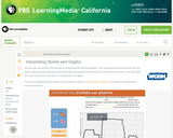
In this interactive activity adapted from Annenberg Learner’s Teaching Math Grades 6–8, …
In this interactive activity adapted from Annenberg Learner’s Teaching Math Grades 6–8, students interpret two line graphs to identify possible locations where the data might have been gathered.
Distributions and Variability Type of Unit: Project Prior Knowledge Students should be …
Distributions and Variability
Type of Unit: Project
Prior Knowledge
Students should be able to:
Represent and interpret data using a line plot. Understand other visual representations of data.
Lesson Flow
Students begin the unit by discussing what constitutes a statistical question. In order to answer statistical questions, data must be gathered in a consistent and accurate manner and then analyzed using appropriate tools.
Students learn different tools for analyzing data, including:
Measures of center: mean (average), median, mode Measures of spread: mean absolute deviation, lower and upper extremes, lower and upper quartile, interquartile range Visual representations: line plot, box plot, histogram
These tools are compared and contrasted to better understand the benefits and limitations of each. Analyzing different data sets using these tools will develop an understanding for which ones are the most appropriate to interpret the given data.
To demonstrate their understanding of the concepts, students will work on a project for the duration of the unit. The project will involve identifying an appropriate statistical question, collecting data, analyzing data, and presenting the results. It will serve as the final assessment.
Students calculate the mean absolute deviation (MAD) for three data sets and …
Students calculate the mean absolute deviation (MAD) for three data sets and use it to decide which data set is best represented by the mean.The concept of mean absolute deviation (MAD) is introduced. Students understand that the sum of the deviation of the data from the mean is zero. Students calculate the MAD and understand its significance. Students find the mean and MAD of a sample set of data.Key ConceptsThe mean absolute deviation (MAD) is a measure of how much the values in a data set deviate from the mean. It is calculated by finding the distance of each value from the mean and then finding the mean of these distances.Goals and Learning ObjectivesGain a deeper understanding of mean.Understand that the mean absolute deviation (MAD) is a measure of how well the mean represents the data.Compare data sets using measures of center (mode, median, mean) and spread (range and MAD).Show that the sum of deviations from the mean is zero.
Students make a box plot for their typical-sixth-grader data from Lesson 7 …
Students make a box plot for their typical-sixth-grader data from Lesson 7 and write a summary of what the plot shows.Using the line plot from Lesson 4, students construct a box plot. Students learn how to calculate the five-number summary and interquartile range (IQR). Students apply this knowledge to the data used in Lesson 7 and describe the data in terms of the box plot. Class discussion focuses on comparing the two graphs and what they show for the sets of data.Key ConceptsA box-and-whisker plot, or box plot, shows the spread of a set of data. It shows five key measures, called the five-number summary.Lower extreme: The smallest value in the data setLower quartile: The middle of the lower half of the data, and the value that 25% of the data fall belowMedian: The middle of the data setUpper quartile: The middle of the upper half of the data, and the value that 25% of the data are aboveUpper extreme: The greatest value in the data setThis diagram shows how these values relate to the parts of a box plot.The length of the box represents the interquartile range (IQR), which is the difference between the lower and upper quartile.A box plot divides the data into four equal parts. One quarter of the data is represented by the left whisker, two quarters by each half of the box, and one quarter by the right whisker. If one of these parts is long, the data in that quarter are spread out. If one of these quarters is short, the data in that quarter are clustered together.Goals and Learning ObjectivesLearn how to construct box plots, another tool to describe data.Learn about the five-number summary, interquartile range, and how they are related to box plots.Compare a line plot and box plot for the same set of data.
Students critique and improve their work on the Self Check from Lesson …
Students critique and improve their work on the Self Check from Lesson 13.Key ConceptsMeasures of spread (five-number summary) show characteristics of the data. It is possible to generate an appropriate data set with this information.Goals and Learning ObjectivesApply knowledge of statistics to solve problems.Identify the five-number summary, and understand measures of center and use their properties to solve problems.Track and review choice of strategy when problem solving.
In this lesson, students draw a line plot of a set of …
In this lesson, students draw a line plot of a set of data and then find the mean of the data. This lesson also informally introduces the concepts of the median, or middle value, and the mode, or most common value. These terms will be formally defined in Lesson 6.Using a sample set of data, students review construction of a line plot. The mean as fair share is introduced as well as the algorithm for mean. Using the sample set of data, students determine the mean and informally describe the set of data, looking at measures of center and the shape of the data. Students also determine the middle 50% of the data.Key ConceptsThe mean is a measure of center and is one of the ways to determine what is typical for a set of data.The mean is often called the average. It is found by adding all values together and then dividing by the number of values.A line plot is a visual representation of the data. It can be used to find the mean by adjusting the data points to one value, such that the sum of the data does not change.Goals and Learning ObjectivesReview construction of a line plot.Introduce the concept of the mean as a measure of center.Use the fair-share method and standard algorithm to find the mean.
Students make a histogram of their typical-student data and then write a …
Students make a histogram of their typical-student data and then write a summary of what the histogram shows.Students are introduced to histograms, using the line plot to build them. They investigate how the bin width affects the shape of a histogram. Students understand that a histogram shows the shape of the data, but that measures of center or spread cannot be found from the graph.Key ConceptsA histogram groups data values into intervals and shows the frequency (the number of data values) for each interval as the height of a bar.Histograms are similar to line plots in that they show the shape and distribution of a data set. However, unlike a line plot, which shows frequencies of individual data values, histograms show frequencies of intervals of values.We cannot read individual data values from a histogram, and we can't identify any measures of center or spread.Histograms sometimes have an interval with the most data values, referred to as the mode interval.Histograms are most useful for large data sets, where plotting each individual data point is impractical.The shape of a histogram depends on the chosen width of the interval, called the bin width. Bin widths that are too large or too small can hide important features of the data.Goals and Learning ObjectivesLearn about histograms as another tool to describe data.Show that histograms are used to show the shape of the data for a wider range of data.Compare a line plot and histogram for the same set of data.
Students use the Box Plot interactive, which allows them to create line …
Students use the Box Plot interactive, which allows them to create line plots and see the corresponding box plots. They use this tool to create data sets with box plots that satisfy given criteria.Students investigate how the box plot changes as the data points in the line plot are moved. Students can manipulate data points to change aspects of the box plot and to see how the line plot changes. Students create box plots that fit certain criteria.Key ConceptsThis lesson focuses on the connection between a data set and its box plot. It reinforces the idea that a box plot shows the spread of a data set, but not the individual data points.Students will observe the following similarities and differences between line plots and box plots:Line plots allow us to see and count individual values, while box plots do not.Line plots allow us to find the mean and the mode of a set of data, while box plots do not.Box plots are useful for very large data sets, while line plots are not.Box plots give us a better picture of how the values in a data set are distributed than line plots do, and they allow us to see measures of spread easily.Goals and Learning ObjectivesExperiment with different line plots to see the effect on the corresponding box plots.Create data sets with box plots that satisfy different criteria.Compare and contrast line plots and box plots.
Lesson OverviewStudents complete a card sort that requires them to match sets …
Lesson OverviewStudents complete a card sort that requires them to match sets of statistics with the corresponding line plots.Students match cards with simple line plots to the corresponding card with measures of center. Some cards include mode, mean, median, and range, and some have one or two measures missing. Students discuss how they determined which cards would match.Key ConceptsTo complete the card sort in this lesson efficiently, students must be able to relate statistical measures with line plots. If they start with the measures that are easy to see, they can narrow down the possible matches.The mode is the easiest measure to see immediately. It is simply the number with the tallest column of dots.The range can be found easily by subtracting the least value in the plot from the greatest.The median can be found fairly quickly by counting to the middle dot or by pairing dots on the ends until reaching the middle.The mean must be calculated by adding data values and dividing.Goals and Learning ObjectivesApply knowledge of measures of center and range to solve problems.Discuss and review strategy choices when problem solving.
Students will apply what they have learned in previous lessons to analyze …
Students will apply what they have learned in previous lessons to analyze and draw conclusions about a set of data. They will also justify their thinking based on what they know about the measures (e.g., I know the mean is a good number to use to describe what is typical because the range is narrow and so the MAD is low.).Students analyze one of the data sets about the characteristics of sixth grade students that was collected by the class in Lesson 2. Students construct line plots and calculate measures of center and spread in order to further their understanding of the characteristics of a typical sixth grade student.Key ConceptsNo new mathematical ideas are introduced in this lesson. Instead, students apply the skills they have acquired in previous lessons to analyze a data set for one attribute of a sixth grade student. Students make a line plot of the data and find the mean, median, range, MAD, and outliers. They use these results to determine a typical value for their data.Goals and Learning ObjectivesDescribe an attribute of a typical sixth grade student using line plots and measures of center (mean and median) and spread (range and MAD).Justify thinking about which measures are good descriptors of the data set.
Students explore how adjusting the bin width or adding, deleting, or moving …
Students explore how adjusting the bin width or adding, deleting, or moving data values affects a histogram.Students use the Histogram interactive to explore how the bin width can affect how the data are displayed and interpreted. Students also explore how adjusting the line plot affects the histogram.Key ConceptsAs students learned in the last lesson, a histogram shows data in intervals. It shows how much data is in each bin, but it does not show individual data. In this lesson, students will see that the same histogram can be made with different sets of data. Students will also see that the bin width can greatly affect how the histogram looks.Goals and Learning ObjectivesExplore what the shape of the histogram tells us about the data set and how the bin width affects the shape of the histogram.Clarify similarities and differences between histograms and line plots.Compare a line plot and histogram for the same set of data.
In this lesson, students are given criteria about measures of center, and …
In this lesson, students are given criteria about measures of center, and they must create line plots for data that meet the criteria. Students also explore the effect on the median and the mean when values are added to a data set.Students use a tool that shows a line plot where measures of center are shown. Students manipulate the graph and observe how the measures are affected. Students explore how well each measure describes the data and discover that the mean is affected more by extreme values than the mode or median. The mathematical definitions for measures of center and spread are formalized.Key ConceptsStudents use the Line Plot with Stats interactive to develop a greater understanding of the measures of center. Here are a few of the things students may discover:The mean and the median do not have to be data points.The mean is affected by extreme values, while the median is not.Adding values above the mean increases the mean. Adding values below the mean decreases the mean.You can add values above and below the mean without changing the mean, as long as those points are “balanced.”Adding values above the median may or may not increase the median. Adding values below the median may or may not decrease the median.Adding equal numbers of points above and below the median does not change the median.The measures of center can be related in any number of ways. For example, the mean can be greater than the median, the median can be greater than the mean, and the mode can be greater than or less than either of these measures.Note: In other courses, students will learn that a set of data may have more than one mode. That will not be the case in this lesson.Goals and Learning ObjectivesExplore how changing the data in a line plot affects the measures of center (mean, median).Understand that the mean is affected by outliers more than the median is.Create line plots that fit criteria for given measures of center.
No restrictions on your remixing, redistributing, or making derivative works. Give credit to the author, as required.
Your remixing, redistributing, or making derivatives works comes with some restrictions, including how it is shared.
Your redistributing comes with some restrictions. Do not remix or make derivative works.
Most restrictive license type. Prohibits most uses, sharing, and any changes.
Copyrighted materials, available under Fair Use and the TEACH Act for US-based educators, or other custom arrangements. Go to the resource provider to see their individual restrictions.