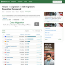
Bar chart of countries ranked by their net migration flow as of …
Bar chart of countries ranked by their net migration flow as of 2005. While the highest net in-flow is generally into large rich countries (USA, Spain, Germany etc.) Afghanistan had the second highest net inflow thanks to returning refugees.
Map shows census divisions (a variably sized region ranging from 1100 and …
Map shows census divisions (a variably sized region ranging from 1100 and 2.5 million people) color coded by the percentage of people living in the area that lived in a different province or territory five years ago. CDs in sparsely populated regions are excluded. The map suggests that there is a great deal of migration into Alberta -- likely to work in the oil industry.
This presentation considers how to begin when teaching the global African diaspora. …
This presentation considers how to begin when teaching the global African diaspora. It emphasizes the incorporation of evidence generated by scholars outside of the discipline of history and offers selected examples as points of entry or intersection with curriculum already in use.
No restrictions on your remixing, redistributing, or making derivative works. Give credit to the author, as required.
Your remixing, redistributing, or making derivatives works comes with some restrictions, including how it is shared.
Your redistributing comes with some restrictions. Do not remix or make derivative works.
Most restrictive license type. Prohibits most uses, sharing, and any changes.
Copyrighted materials, available under Fair Use and the TEACH Act for US-based educators, or other custom arrangements. Go to the resource provider to see their individual restrictions.