This lab activity is designed for science students in an introductory climatology course. Upon successful completion of the activity, students will have demonstrated an ability to:
Independently navigate and download climate data from online data libraries.
Work with different file types (NetCDF and CSV).
Write appropriate MATLAB code to read and manipulate climate data, and create plots (time series and maps) as instructed.
Extract meaningful information from large 3-dimensional datasets.
Understand and apply fundamental climatology concepts, such as:
Climate statistics (temporal and spatial mean and anomaly; trends; baselines)
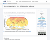
Ice-albedo feedback resulting in disproportionate sensitivity to climate change in polar regions
(Note: this resource was added to OER Commons as part of a batch upload of over 2,200 records. If you notice an issue with the quality of the metadata, please let us know by using the 'report' button and we will flag it for consideration.)
- Subject:
- Atmospheric Science
- Biology
- Life Science
- Physical Science
- Material Type:
- Activity/Lab
- Provider:
- Science Education Resource Center (SERC) at Carleton College
- Provider Set:
- Teach the Earth
- Author:
- Janel Hanrahan
- Date Added:
- 11/25/2019