In this module, students reconnect with and deepen their understanding of statistics …
In this module, students reconnect with and deepen their understanding of statistics and probability concepts first introduced in Grades 6, 7, and 8. Students develop a set of tools for understanding and interpreting variability in data, and begin to make more informed decisions from data. They work with data distributions of various shapes, centers, and spreads. Students build on their experience with bivariate quantitative data from Grade 8. This module sets the stage for more extensive work with sampling and inference in later grades.
Find the rest of the EngageNY Mathematics resources at https://archive.org/details/engageny-mathematics.
Students learn a simple technique for quantifying the amount of photosynthesis that …
Students learn a simple technique for quantifying the amount of photosynthesis that occurs in a given period of time, using a common water plant (Elodea). They can use this technique to compare the amounts of photosynthesis that occur under conditions of low and high light levels. Before they begin the experiment, however, students must come up with a well-worded hypothesis to be tested. After running the experiment, students pool their data to get a large sample size, determine the measures of central tendency of the class data, and then graph and interpret the results.
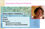
An introduction and examples of how to use Descriptive Statistics. It is …
An introduction and examples of how to use Descriptive Statistics. It is about how we present and decribe the data in our sample in the best possible way. This covers tabels, graphs, measures of location and measures of spread/variability.
Why is it important that students be careful what is posted for …
Why is it important that students be careful what is posted for everyone to see? Students will investigate and discuss these questions during this module that directly relate to their daily life. Students will work cooperatively in groups to design an infomercial to be presented to elementary students and/or parents and community members. Key Learning Targets: I can use technology to produce and publish my work, and link to sources.I can include multimedia projects or visual displays when they will be helpful in clarifying and emphasizing information.I can actively participate and contribute to a discussion with my teacher and my peers. I can present my findings to a group or audience in a clear and concise way.I can create a storyboard to prepare a public service announcement. I can compare contrast trends of technology. I can write an explanatory paragraph to examine a topic (present and future digital footprint).
In this problem-based learning module, students will investigate why is it important that …
In this problem-based learning module, students will investigate why is it important that students be careful what is posted for everyone to see. Students will investigate and discuss these questions during this module that directly relate to their daily life. Students will work cooperatively in groups to design an infomercial to be presented to elementary students and/or parents and community members. Key Learning Targets: I can use technology to produce and publish my work, and link to sources.I can include multimedia projects or visual displays when they will be helpful in clarifying and emphasizing information.I can actively participate and contribute to a discussion with my teacher and my peers. I can present my findings to a group or audience in a clear and concise way.I can create a storyboard to prepare a public service announcement. I can compare contrast trends of technology. I can write an explanatory paragraph to examine a topic (present and future digital footprint).
Students use U.S. Geological Survey (USGS) real-time, real-world seismic data from around …
Students use U.S. Geological Survey (USGS) real-time, real-world seismic data from around the planet to identify where earthquakes occur and look for trends in earthquake activity. They explore where and why earthquakes occur, learning about faults and how they influence earthquakes. Looking at the interactive maps and the data, students use Microsoft® Excel® to conduct detailed analysis of the most-recent 25 earthquakes; they calculate mean, median, mode of the data set, as well as identify the minimum and maximum magnitudes. Students compare their predictions with the physical data, and look for trends to and patterns in the data. A worksheet serves as a student guide for the activity.
Students visit second- and fourth-grade classes to measure the heights of older …
Students visit second- and fourth-grade classes to measure the heights of older students using large building blocks as a non-standard unit of measure. They also measure adults in the school community. Results are displayed in age-appropriate bar graphs (paper cut-outs of miniature building blocks glued on paper to form bar graphs) enabling a comparison of the heights of different age groups. The activities that comprise this activity help students develop the concepts and vocabulary to describe, in a non-ambiguous way, how heights change as children age. This introduction to graphing provides an important foundation for creating and interpreting graphs in future years.
This activity introduces Geographic Information Systems (GIS) and poses questions that help …
This activity introduces Geographic Information Systems (GIS) and poses questions that help students answer questions that require spatial data. Students examine questions about communities and populations from local to state to national scales. Six GIS, math and mapping activities are identified in this resource. This resource is from PUMAS - Practical Uses of Math and Science - a collection of brief examples created by scientists and engineers showing how math and science topics taught in K-12 classes have real world applications.
Distributions and Variability Type of Unit: Project Prior Knowledge Students should be …
Distributions and Variability
Type of Unit: Project
Prior Knowledge
Students should be able to:
Represent and interpret data using a line plot. Understand other visual representations of data.
Lesson Flow
Students begin the unit by discussing what constitutes a statistical question. In order to answer statistical questions, data must be gathered in a consistent and accurate manner and then analyzed using appropriate tools.
Students learn different tools for analyzing data, including:
Measures of center: mean (average), median, mode Measures of spread: mean absolute deviation, lower and upper extremes, lower and upper quartile, interquartile range Visual representations: line plot, box plot, histogram
These tools are compared and contrasted to better understand the benefits and limitations of each. Analyzing different data sets using these tools will develop an understanding for which ones are the most appropriate to interpret the given data.
To demonstrate their understanding of the concepts, students will work on a project for the duration of the unit. The project will involve identifying an appropriate statistical question, collecting data, analyzing data, and presenting the results. It will serve as the final assessment.
Groups begin presentations for their unit project. Students provide constructive feedback on …
Groups begin presentations for their unit project. Students provide constructive feedback on others' presentations.Key ConceptsThe unit project serves as the final assessment. Students should demonstrate their understanding of unit concepts:Measures of center (mean, median, mode) and spread (MAD, range, interquartile range)The five-number summary and its relationship to box plotsRelationship between data sets and line plots, box plots, and histogramsAdvantages and disadvantages of portraying data in line plots, box plots, and histogramsGoals and Learning ObjectivesPresent projects and demonstrate an understanding of the unit concepts.Provide feedback for others' presentations.Review the concepts from the unit.
Remaining groups present their unit projects. Students discuss teacher and peer feedback.Key …
Remaining groups present their unit projects. Students discuss teacher and peer feedback.Key ConceptsThe unit project serves as the final assessment. Students should demonstrate their understanding of unit concepts:Measures of center (mean, median, mode) and spread (MAD, range, interquartile range)The five-number summary and its relationship to box plotsRelationship between data sets and line plots, box plots, and histogramsAdvantages and disadvantages of portraying data in line plots, box plots, and histogramsGoals and Learning ObjectivesPresent projects and demonstrate an understanding of the unit concepts.Provide feedback for others' presentations.Review the concepts from the unit.Review presentation feedback and reflect.
GalleryCreate a Data SetStudents will create data sets with a specified mean, …
GalleryCreate a Data SetStudents will create data sets with a specified mean, median, range, and number of data values.Bouncing Ball Experiment How high does the class think a typical ball bounces (compared to its drop height) on its first bounce? Students will conduct an experiment to find out.Adding New Data to a Data Set Given a data set, students will explore how the mean changes as they add data values.Bowling Scores Students will create bowling score data sets that meet certain criteria with regard to measures of center.Mean Number of Fillings Ten people sit in a dentist's waiting room. The mean number of fillings they have in their teeth is 4, yet none of them actually have 4 fillings. Students will explain how this situation is possible.Forestland Students will examine and interpret box plots that show the percentage of forestland in 20 European countries.What's My Data?Students will create a data set that fits a given histogram and then adjust the data set to fit additional criteria.What's My Data 2? Students will create a data set that fits a given box plot and then adjust the data set to fit additional criteria.Compare Graphs Students will make a box plot and a histogram that are based on a given line plot and then compare the three graphs to decide which one best represents the data.Random Numbers What would a data set of randomly generated numbers look like when represented on a histogram? Students will find out!No Telephone? The U.S. Census Bureau provides state-by-state data about the number of households that do not have telephones. Students will examine two box plots that show census data from 1960 and 1990 and compare and analyze the data.Who Is Taller?Who is taller—the boys in the class or the girls in the class? Students will find out by separating the class height data gathered earlier into data for boys and data for girls.
In this lesson, students are given criteria about measures of center, and …
In this lesson, students are given criteria about measures of center, and they must create line plots for data that meet the criteria. Students also explore the effect on the median and the mean when values are added to a data set.Students use a tool that shows a line plot where measures of center are shown. Students manipulate the graph and observe how the measures are affected. Students explore how well each measure describes the data and discover that the mean is affected more by extreme values than the mode or median. The mathematical definitions for measures of center and spread are formalized.Key ConceptsStudents use the Line Plot with Stats interactive to develop a greater understanding of the measures of center. Here are a few of the things students may discover:The mean and the median do not have to be data points.The mean is affected by extreme values, while the median is not.Adding values above the mean increases the mean. Adding values below the mean decreases the mean.You can add values above and below the mean without changing the mean, as long as those points are “balanced.”Adding values above the median may or may not increase the median. Adding values below the median may or may not decrease the median.Adding equal numbers of points above and below the median does not change the median.The measures of center can be related in any number of ways. For example, the mean can be greater than the median, the median can be greater than the mean, and the mode can be greater than or less than either of these measures.Note: In other courses, students will learn that a set of data may have more than one mode. That will not be the case in this lesson.Goals and Learning ObjectivesExplore how changing the data in a line plot affects the measures of center (mean, median).Understand that the mean is affected by outliers more than the median is.Create line plots that fit criteria for given measures of center.
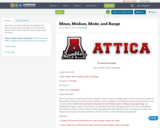
This lesson unit is intended to help you assess how well students …
This lesson unit is intended to help you assess how well students are able to: Calculate the mean, median, mode, and range from a frequency chart; and to use a frequency chart to describe a possible data set, given information on the mean, median, mode, and range.
No restrictions on your remixing, redistributing, or making derivative works. Give credit to the author, as required.
Your remixing, redistributing, or making derivatives works comes with some restrictions, including how it is shared.
Your redistributing comes with some restrictions. Do not remix or make derivative works.
Most restrictive license type. Prohibits most uses, sharing, and any changes.
Copyrighted materials, available under Fair Use and the TEACH Act for US-based educators, or other custom arrangements. Go to the resource provider to see their individual restrictions.