Read the Fine Print
Educational Use
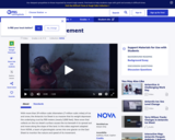
This video segment adapted from NOVA explains why ice sheets move. To find out how fast they move, scientists carve a tunnel through a glacier.
- Subject:
- Applied Science
- Environmental Science
- Material Type:
- Activity/Lab
- Diagram/Illustration
- Provider:
- PBS LearningMedia
- Provider Set:
- PBS Learning Media: Multimedia Resources for the Classroom and Professional Development
- Author:
- National Science Foundation
- WGBH Educational Foundation
- Date Added:
- 12/17/2005